Different devices have different screen sizes. It's really hard to create an app that looks the same across different devices. One way to tackle this situation is determine how much each component should take regardless of screen size. Say you have one image and one button. If you want the image to take 80% of the height and the button to take the remaining 20%, then calculate that using the device's height and set accordingly.
App Inventor's Screen has width and height which are the width and height of the actual device. We can use them to calculate the space our components should take in any device.
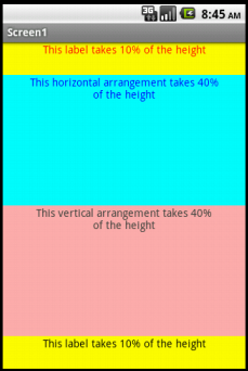
In the screenshot above, we have four main components - a label on top, a horizontal arrangement, a vertical arrangement, and another label on bottom. Each arrangement also has a label component. In design view, it looks like this-
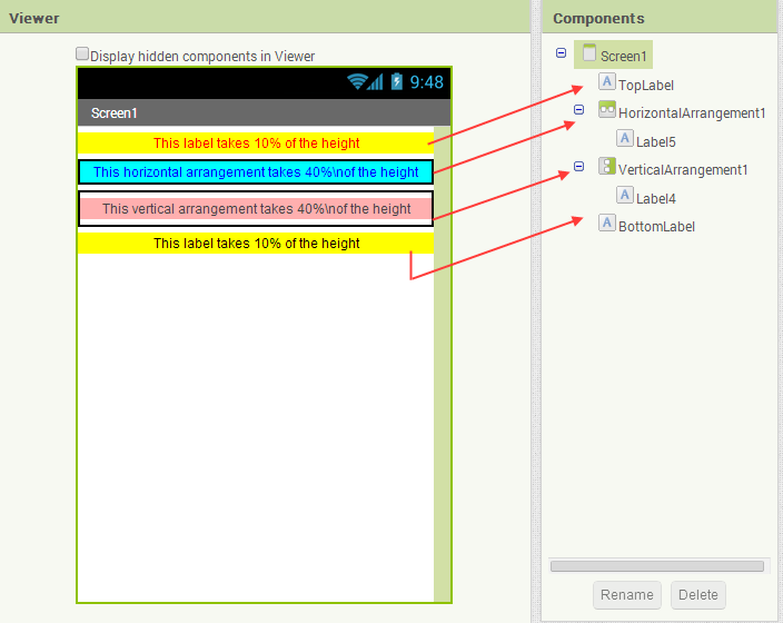
We want the top label to take 10% of the height, each arrangement to take 40%, and the last 10% we want the bottom label to have. That is a total of 100%. We want all components to take full width.
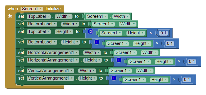
As you can see in screenshot above, we used screen's width for all of our components. Then we allocated the height for each component using screen's height. Note that there is a label inside each arrangement component. In design view, we set both of their widths and heights to Fill parent to take the whole width and height of their respective arrangement.
You can download the source file for this project UniversalScreenSize.
